Colour management

×

Error message

Notice: unserialize(): Error at offset 5863 of 11211 bytes in variable_initialize() (line 1255 of /mnt/www/html/oxforddev/docroot/includes/bootstrap.inc).

User level: Site Owner; Site Administrator


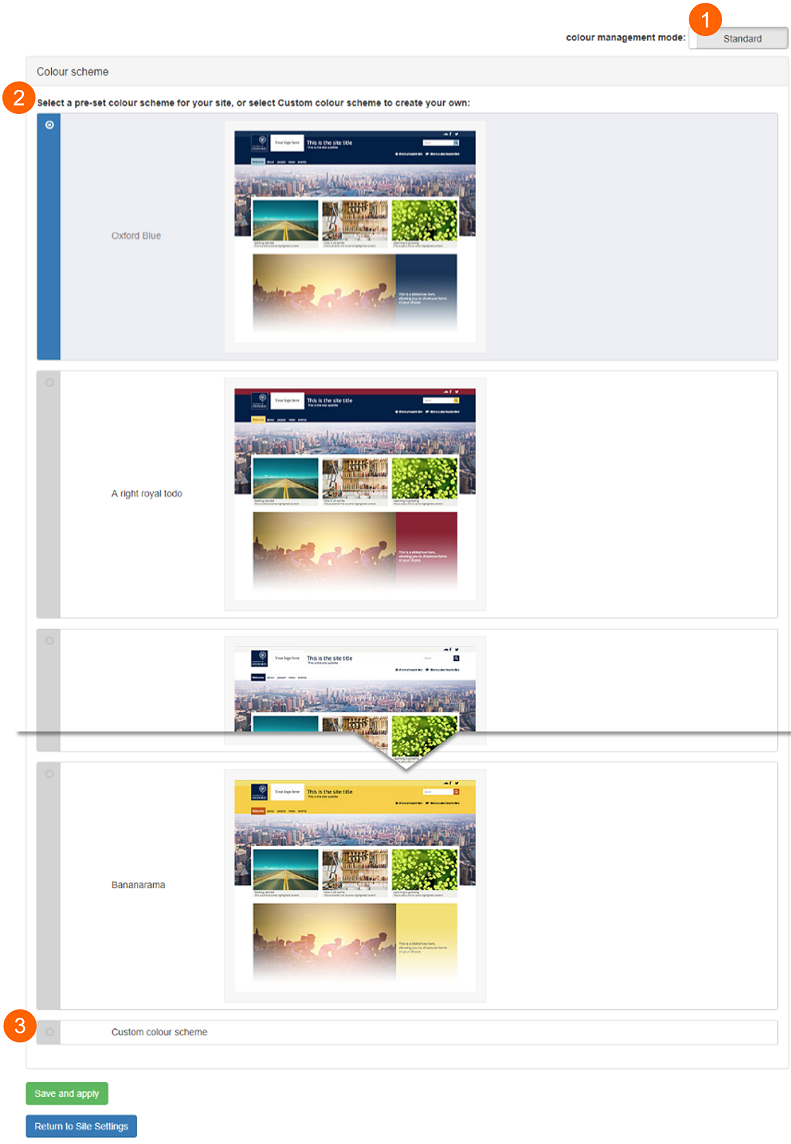
There are two colour management modes: Standard and Advanced. You can switch between these modes using the colour management mode toggle (1) at the top of the screen.

Colour settings - Initial screen

Expand All

The standard settings provide a selection of preset colour themes and a basic custom colour picker.

[2] Preset colour themes

There are 8 preset colour themes to choose from:

  • Oxford Blue
  • A right royal todo
  • Oxford White
  • Fresh and Light
  • Silverback
  • Olive Oyl
  • Fireside
  • Bananarama

To apply one to your site, select it by clicking on the panel it is displayed within, and click 'Save and apply'.

[3] Custom colours

The Custom colour scheme settings provides configuration options for 11 features within the site. These settings cover all visual elements of the site appearance. For each colour configuration option, users can configure the background colour and text colour, apart from the 'Page background' colour setting, which only provides the option to edit the background colour.

For more granular colour customisation use the Advanced colour settings.
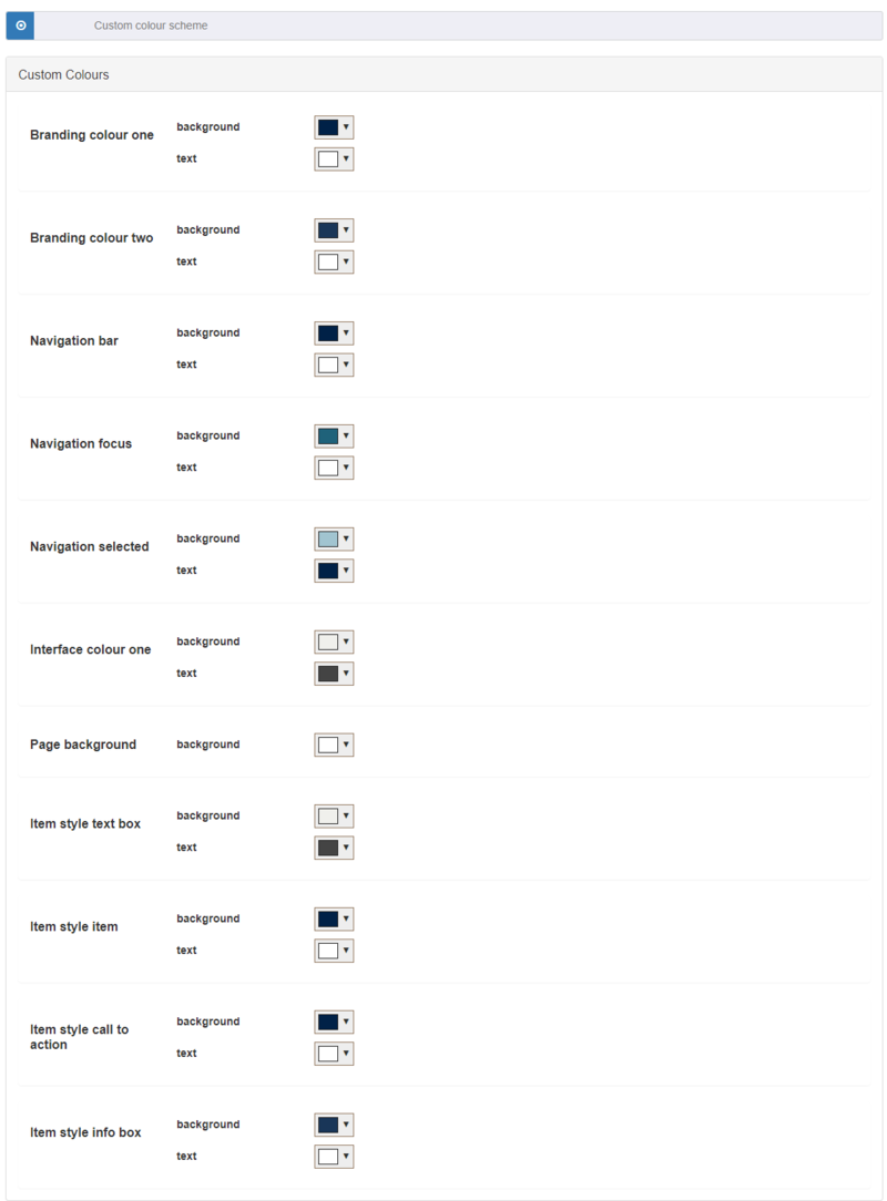
Standard custom colour picker


Advanced colour management enables users to choose their own foreground/background colour pairings for a range of site elements. Elements are grouped by category and may have several colour-configurable areas or states. Each colour selection has a schematic diagram of the relevant page element with the affected area highlighted in orange.

Once you have selected an element to configure, you can select a colour from the preset palette (1) or define your custom colour by inputting a hexadecimal value (2). Note whether the background colour-text colour combination meets accessibility standards (3). When you are satisfied with the colour selection and the minimum (AA) accessibility standard is met, click Select (4).

Advanced colour settings


Most elements possess foreground/background pairs of colour settings; some elements such as page background only have a single configurable colour.

All foreground/background colour pairings are checked for suitable contrast against accessibility guidelines. All pairing contrasts must at least meet AA level contrast, with values below AAA standard triggering a warning. This is an important mechanism in making Mosaic websites as accessible as possible, in line with rules for University websites.

Less than AA standard

Accessibility notice - colour choice does not meet AA standard

Meets AA standard, but does not meet AAA standard

Accessibility notice - meets AA standard, but does not meet AAA standard

Manually checking colour contrast

Contrast checking works by comparing text’s colour to the colour of the background it is placed on. Where text sits over an image, there is no way to make this comparison because:

  1. The background colour is determined by the image, not a specified colour value
  2. The text will be positioned over different portions of the image depending on the responsive positioning of the text relative to the background image

In circumstances like these, it is up to content creators to ensure that there is sufficient contrast between the text and the background image to be readable in all circumstances (bearing in mind that the text will sit on different portions of the image depending on screen width, font size and character length of the title, position of the image).